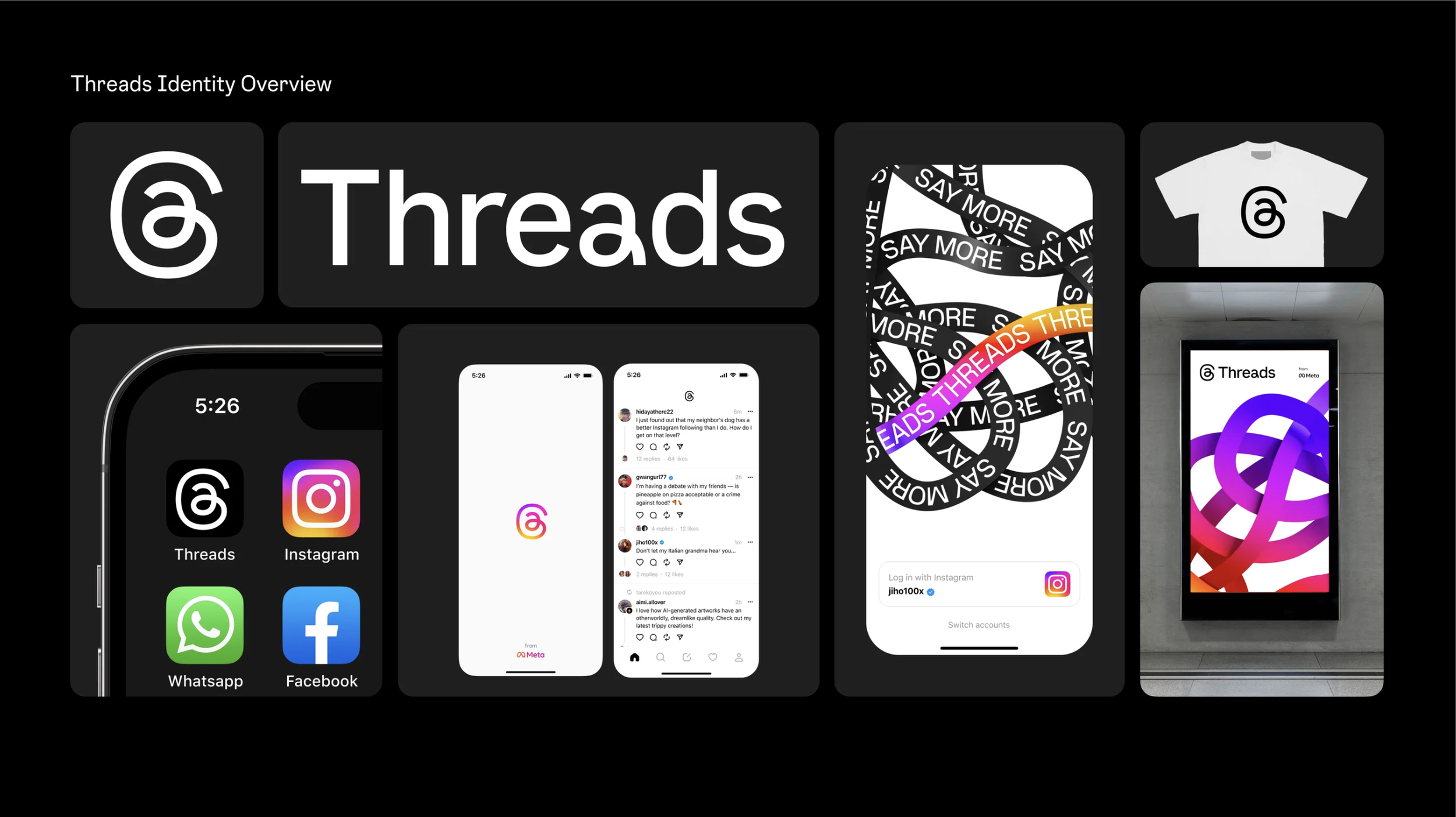

The idea was simple: a text-based version of Instagram for sharing “ideas and trends”. But the branding of Threads had to work hard and be designed in under 2 months.
Threads needed to feel tied to Instagram and the tools and community its users have come to expect, but also to stand out from well-established competitors and feel separate, with a unique voice of its own.
We explored references around written language, the idea of “connection” and the name Threads – which was yet to be finalised while we developed the identity. We returned to the ‘@’ symbol again and again during development, as a shape which is synonymous with online identity. Though other options were also considered, like a ‘t’ that incorporated a loop and another at sign that was housed in the Instagram ‘squircle’ container.
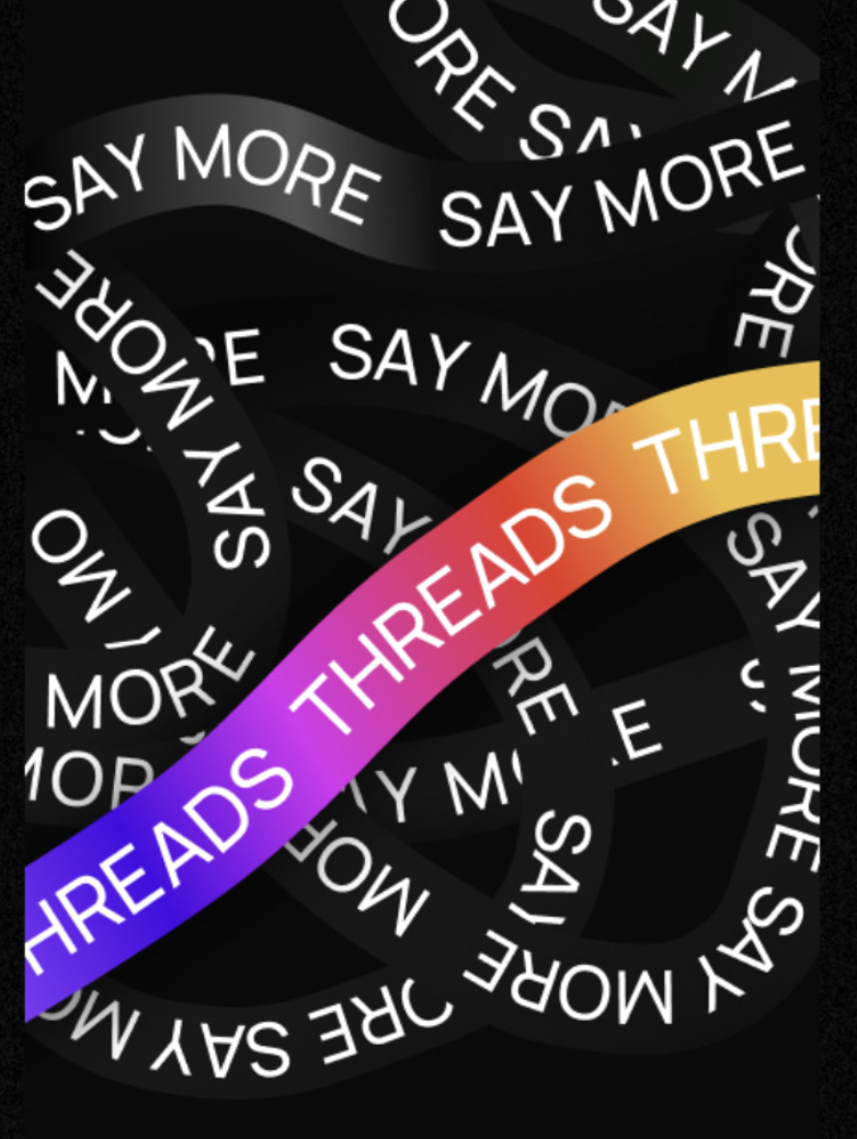
And while Instagram’s colorful gradient represented the color spectrum of photography, we chose black and white to represent text.